Intervention: Home Depot Form Validation
November 2nd, 2010This intervention is more than an annoyance about an HTML form. The implication of a poorly designed form field is suppressed response. That has a material impact on the business.
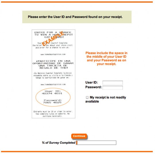
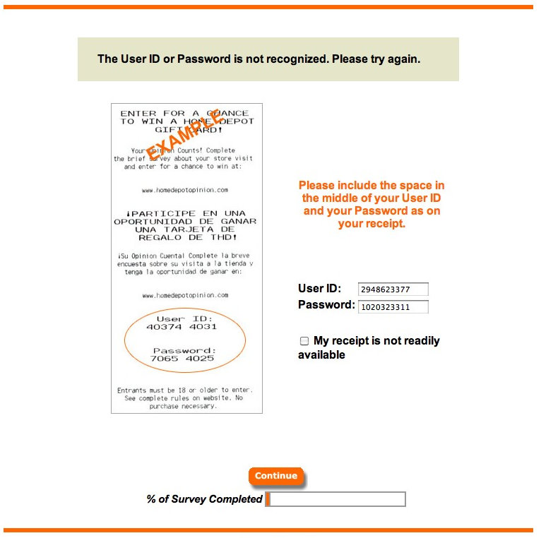
In the example below, I entered my codes into the form and got an error message. I didn’t include a space between each group of numbers. I got so annoyed, I abandoned the survey. If they’re going to be this nit-picky and irritating on page one, imagine what awaits me inside. Whatever it is, I don’t want to know. Done.
Home Depot spends a lot of money on this customer feedback program (e.g. programming all the POS machines with the individual transaction codes, etc.). I don’t know what their response rate is, but one can only image that for what they’ve spent on this system, every entry counts. With a simple coding change to make the visitor’s life less frustrating, Home Depot marketing managers can prevent abandonment and raise the response rate for this program. Just one step closer to “more doing.”

This seems simple. Just enter the numbers...

I'm barely willing to provide my feedback on a $10 transaction. Don't make it more difficult by being fussy about how I enter the code you give me.

 Troubled experiences that need a little counseling ("Interventions"), great experiences that serve as role models ("Inspirations"), and curious or questionable experiences teetering on the brink of a breakdown ("Investigations"). We'll showcase smart experience strategies, great interaction design, and thoughts on transforming marketing meltdowns into model experiences. Our mission: help companies create great experiences that attract attention, convert new customers, generate engagement and cultivate loyalty.


