Intervention: Navigation Woes Plague Epicurious iPhone App
January 12th, 2011My excitement over the recently released version (2.2) of Epicurious for iPhone evaporated when I discovered three things:
- A fee to sync recipes on the iPhone with those saved in the inadequate recipe box on the website (I had presumed this would be free);
- An advertisement with a close button that sends people into the App Store, repeatedly;
- The failure to correct major navigational shortcomings in the app.
Let’s take a closer look at why Epicurious mobile has been sent to UX Rehab.
1. A $1.99 for syncing your recipe box
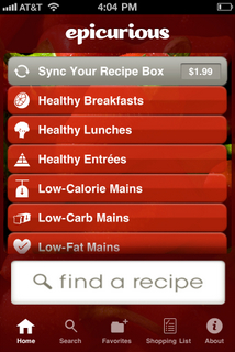
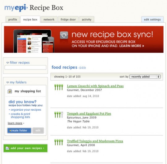
I know: it’s only $1.99, apps aren’t free to develop, and I’ve never given Epicurious a cent for all the value it’s given me. BUT, before I part with that half cup of coffee, I need a more useful recipe box in a VERY fundamental way. Let me show you, starting with the current recipe box on the website:
Where are the pictures? I’ve been collecting these 103 recipes for years (not to mention the dozens I could add from my iPhone and iPad)—I don’t remember what they look like. Putting food on the table is a VERY visual activity, and this list—my own recipe box—shows less than the list of recipes I get after I search the site. Also, in my own recipe box, where are the filters that help me sort through this list? The site is currently unable to show me JUST the appetizers that I’ve been collecting all these years, for example. I guess I could make my own folders, but how onerous when the familiar filters (see below) can merely be added to this page.
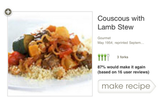
So what should my recipe box look like? Why not use the interface they already have? The one you get when you search for recipes on the site. It offers a visual preview and robust filters.
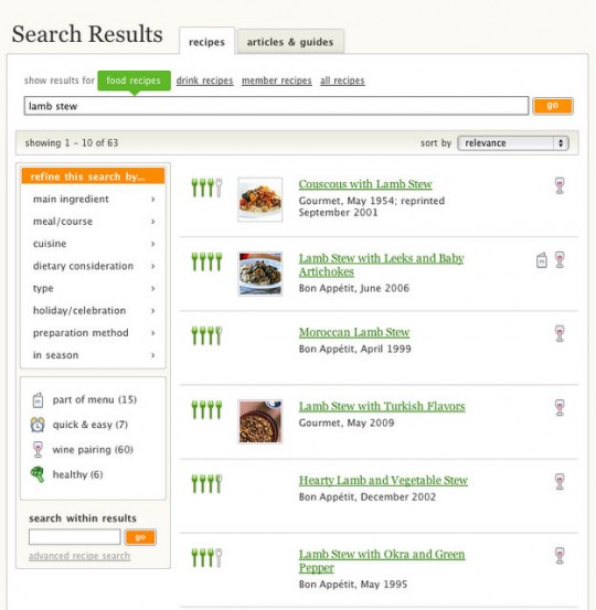
It probably cost them more to design and develop the two different interfaces than it would have to just have re-used the same structure. It needs to be improved—then we’ll talk about $1.99. Meanwhile, I’m open to competitive apps (opportunity awaits).
2. The advertisement that never closes.
Oh, man, come on. I think it took me four cycles of clicking the close icon in the top right of this screen shot and being taken to the App store, exiting the store, finding and re-opening the app, and doing it all over again before it finally stopped showing the ad. Then after a while it happened again and again. We all know what this problem is: poor testing before release (or no testing). Maybe the plummeting score in the App store will be enough to avoid that mistake again. But how many customers—and potential customers—are now lost? And what’s the cost to the brand? Yikes. There’s a breakdown in planning, process and/or people on this one. Isn’t it amazing how quickly a small issue becomes a big problem? Keep reading.
3. Navigational shortcomings.
In a nutshell, if you lose your place and/or just need to find your way to a recipe you remember seeing, you’re hosed. And we REALLY need some additional filtering to sort through lists of hundreds or thousands of recipe results, some of which come from convenient (?) promotional buttons.
To understand the problem, you need to understand the basics of navigating the app. To start, you can either click one of the preset buttons (see the very first image above), or you can use the search screen to look for something more precise. When you get your results, you have two options for browsing them:
a. Swipe one-by-one through a list of recipes, seeing:
- title
- source
- preview picture
- summary rating
- percentage of people who would make it again
- the number of reviewers
- which recipe this is relative to all the matching results (e.g. 48 of 256 results).
Then, you can click to see a bigger photo, full reviews, ingredients and preparation steps.
b. Scroll through a list of recipes using the red list button on the top right of the screen, seeing:
- title (sometimes)
- preview picture
Let’s walk through a typical scenario. I enter my search terms and see the results:
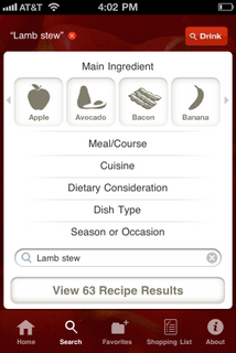
I click View Results to explore the matches, and at this point I start using method “a” to explore them—the swipe method. There are actually two ways to do this. If you turn the phone, you can get the nav elements out of the way and swipe through in horizontal view (however in horizontal view, strangely, you can’t see the reviews for the recipe—this lack of consistency is one of the major flaws of the app, and makes it more confusing than it has to be, as you’ll see below).
After 10 swipes I get an ad. Fine. But you know what? If I’m swiping through 63 recipes, I don’t need to see this 6 times. And swiping the ad away takes longer than swiping to the next recipe. Is that really necessary? Isn’t there a better ad experience possible in this app? Sponsorships? Recipe contests? Something more meaningful? Something I might actually want to participate in? Something that doesn’t get in my way? Going back to the $1.99, how about I pay $.99 to get these interruptive ads out of here?

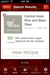
Okay, great, I get to recipe 61 of 63, which turns out to be the last recipe (swipe all you want, you won’t get to 62 and 63—poor code? lack of testing?). But the real problem here comes if I ever need to get back to this recipe (maybe I accidentally touched a nav element like Search or the Favorites button and it doesn’t remember my place when I come back, or maybe I need to find my way back to this recipe after searching for other things first).
So let’s say I have a fat finger and in the above screen, I accidentally hit the Search button. OOPS! I’m back at the search screen. Square one. From here, how to I get back to a recipe I was looking at?
The answer is: the hard way! A good app anticipates and prevents user errors. This app has a long way to go before being that good. So let’s find that recipe again. Give the designers credit, this used to be a lot harder than it is now…but they’re not off the hook yet. Let’s click View Results. Now we’re back at the first recipe:
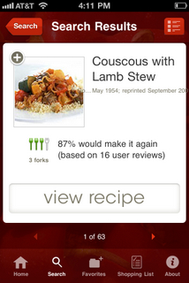
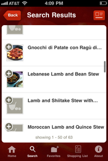
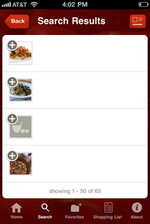
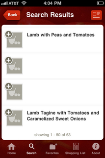
Okay, there’s a little trick here. This time, instead of swiping 60 times, I can use the scroll view by clicking the swipe/scroll toggle on the top right. This loads a list that I can scroll through, but wait—there are no titles! I let this screen sit here for a couple minutes in more than one test, but the titles never fully loaded. Geez.
Scrolling a bit reveals the problem throughout the list. How would I know where I am here? There aren’t any numbers telling me how far down in the list I am. I could scroll to the end but…
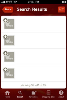
Oh, boy, this is interesting (ignoring the missing titles for now). I scroll to the end of the list of the first 50 results, and now I see this: “showing 51-63 of 63”. But where am I? I can’t scroll down anymore! Has the app loaded the second page, and left me at the bottom of the list of 51-63? This is fine if I’m trying to find the last four results in the list, but if I’m looking for 51-58, I have to manually scroll up to see them—assuming I really am looking at the second page of results. This is a mess. There is no logical pagination. I can’t figure out where the first 50 end and the next set begins.
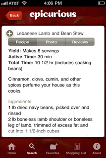
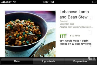
Let’s shift our attention. Let’s say a recipe you’re interested in catches your eye: Lebanese Lamb and Bean Stew. As I always do, I first ask: how did people rate it? Would people make it again? What’s the source for this recipe? Maybe I can click to find out:
Nope. It’s not in these three tabs.
But look what I learned one day by mistake! Remember the first result screen (way up)? Turn the phone sideways. That’s how you get recipe information in “scroll” mode. Not very scanable though—I have to tilt my phone for each recipe I want to see rating details for, after I’ve already selected the recipe. That extra time spent renders scroll view pretty impractical for deciding which recipes are worth pursuing at a glance. Unfortunately, at this point, unlike when you’re in swipe view, you can’t swipe forward to the next recipe from this view. Instead, you have to re-orient the phone, then click Back from the screen above this note to get to scroll view. That’s too much work to get to critical information that helps me to make recipe decisions. And the inconsistency in swipe behavior between horizontal scroll view and horizontal swipe view makes no sense.
So, let’s wrap up point 3 about the navigation woes.
Scroll view is a bust. Titles don’t always show up. It doesn’t have the key rating and source information I need in a quickly scannable form—and it takes way too many steps to find it. Pagination is confusing—I can’t tell where I am in the list, and the recipes aren’t numbered to help in that goal. Imagine if there were hundreds of matching results—if you were looking for a specific recipe, you’d be at your wit’s end.
Swipe view is a bust. I can’t quickly find a recipe that I was looking for previously. It fails to prevent fairly common “fat finger” errors or other errant touches. I have to swipe through potentially dozens or hundreds of recipes to get back to one I saw. Completely impractical and frustrating.
Is there a solution?
Yes. There are two places to focus:
1. Better navigation—here’s where I’d start experimenting: when I’m looking at recipe 35 of 289, how about letting me pinch the screen to see some kind of pagination. Maybe a fast swipe interface…imagine all the recipe cards get smaller and line up on a horizontal line. If I swipe in that mode, I can speed through dozens at a time. When I tap a card, I see the card in full view again, and I’m way ahead in the list. Alternatively, don’t change the visual at all—simply allow a two-finger swipe to speed through the horizontal array. There are surely several other alternatives that would work, too.
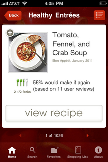
2.Better filtering. Look at the results for this great category of Healthy Entrees:
1,026 RESULTS! How many of those do you want to swipe through before you give up? I’ve done close to 100 before. And I’m starting to lose patience at 50. How about instead of that underperforming scroll view button (or in addition to it, if anyone wants argue that it can be rehabbed and be useful)—there’s a Refine button instead? Behind it, a screen that lets you filter just like you can on a regular search! The flip side of that coin is that you should be able to select a filter on the search page for anything that deserves a special button on the home page. These enormous lists must be tamed.
Summary
It’s clear by using the app that there is a management problem at Condé Nast preventing a superior user experience. The lack of appropriate product management is allowing one or more of the following:
- Lack of sufficient scenario planning,
- Lack of real user testing (beyond the office walk-around method and family and friends), and/or an inability to solve problems that arise,
- Lack of code testing, and/or an inability to respond to technical problems that arise.
Those problems could reveal a lack of funding for the appropriate staff to plan, manage and build the app. That would be a shame. This app deserves better. There are clear ways to make the user experience better. And right now, Condé Nast is not doing all it can to help ensure long-term customer loyalty for this brand—something that shouldn’t be taken for granted. Isn’t it amazing how quickly a collection of small issues become a big problem?
Epicurious for iPhone, welcome to UX Rehab.


 Troubled experiences that need a little counseling ("Interventions"), great experiences that serve as role models ("Inspirations"), and curious or questionable experiences teetering on the brink of a breakdown ("Investigations"). We'll showcase smart experience strategies, great interaction design, and thoughts on transforming marketing meltdowns into model experiences. Our mission: help companies create great experiences that attract attention, convert new customers, generate engagement and cultivate loyalty.


